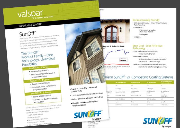
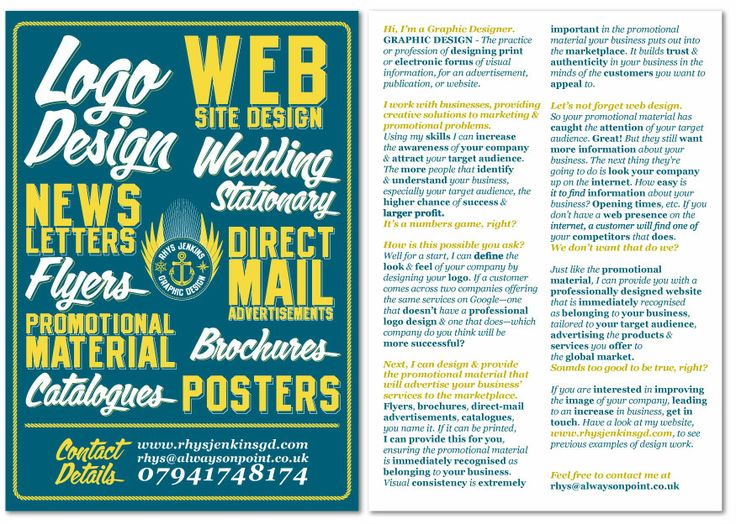
An effective flyer can be one of the best marketing tools a business can use to sell more goods or services. Unfortunately, most people have no idea how to design a flyer that sells and are content to have a lackluster, uninspiring one that draws little interest from their target market. It doesn’t have to be that way. Here’s how to design a flyer that sells.
An Effective Flyer Always Speaks to the Reader
An effective flyer directly addresses the buyer’s wants and needs and doesn’t bore them with information about the background of the company or other information of little interest to the reader. There’s only limited space on a flyer and it’s important to be hard hitting in the limited space that’s available. A flyer should make it clear how the product or service will benefit the customer and focus in on this with laser like intensity. Readers always have their own self interests in mind and want to quickly know how a product will make their life better.
For an Effective Flyer, Always Include a Photo
Nothing draws the eye to a flyer quicker than a powerful photo. Flyers without one are less likely to be read because buyers are unlikely to notice them. If possible, use a color photo of the product being offered. This may be more expensive to reproduce, but the increased interest a colored flyer attracts can be significant.
To Make a Flyer That Sells, Use Unusual Paper
Plain white paper is okay for some flyers, but unusual paper colors and textures draw more attention. Visit an art supply store and look for inexpensive, but unusual papers to print a flyer on. Experiment with different ones to see which creates more interest.

